weekly staff lookup and email work

MAPWA / B2B / Internal Tool · Workflow Design
Streamlining practicum matching for students and administrators
Role
Product Designer
Team
1 Designer, 1 Developer, 1 Team Lead
Timeline
8 months
Tools
Figma
A practicum matching platform that coordinates applications, placements, and multi round matching across students and administrators.
I reframed the experience around clarity and decision support, redesigning the student flow to make next steps explicit and the admin dashboard to surface where action was needed.
Impact
average task completion time
student inquiry emails per matching cycle
Prototype
01 · Helping students find and compare practicum options
I reduced competing information and surfaced what students could act on now—current round, deadline, site details, and next actions.
Information Hierarchy02 · Making application progress and next steps explicit
Every major action now confirms what happened, shows the current status, and makes the next step explicit.
Feedback + Status03 · Helping administrators spot where action is needed
The admin dashboard turns scattered records into one operating view for matching progress, exceptions, capacity, and unresolved students.
Operational VisibilityHow I Think
01 · Mapping student questions to gaps in the application flow
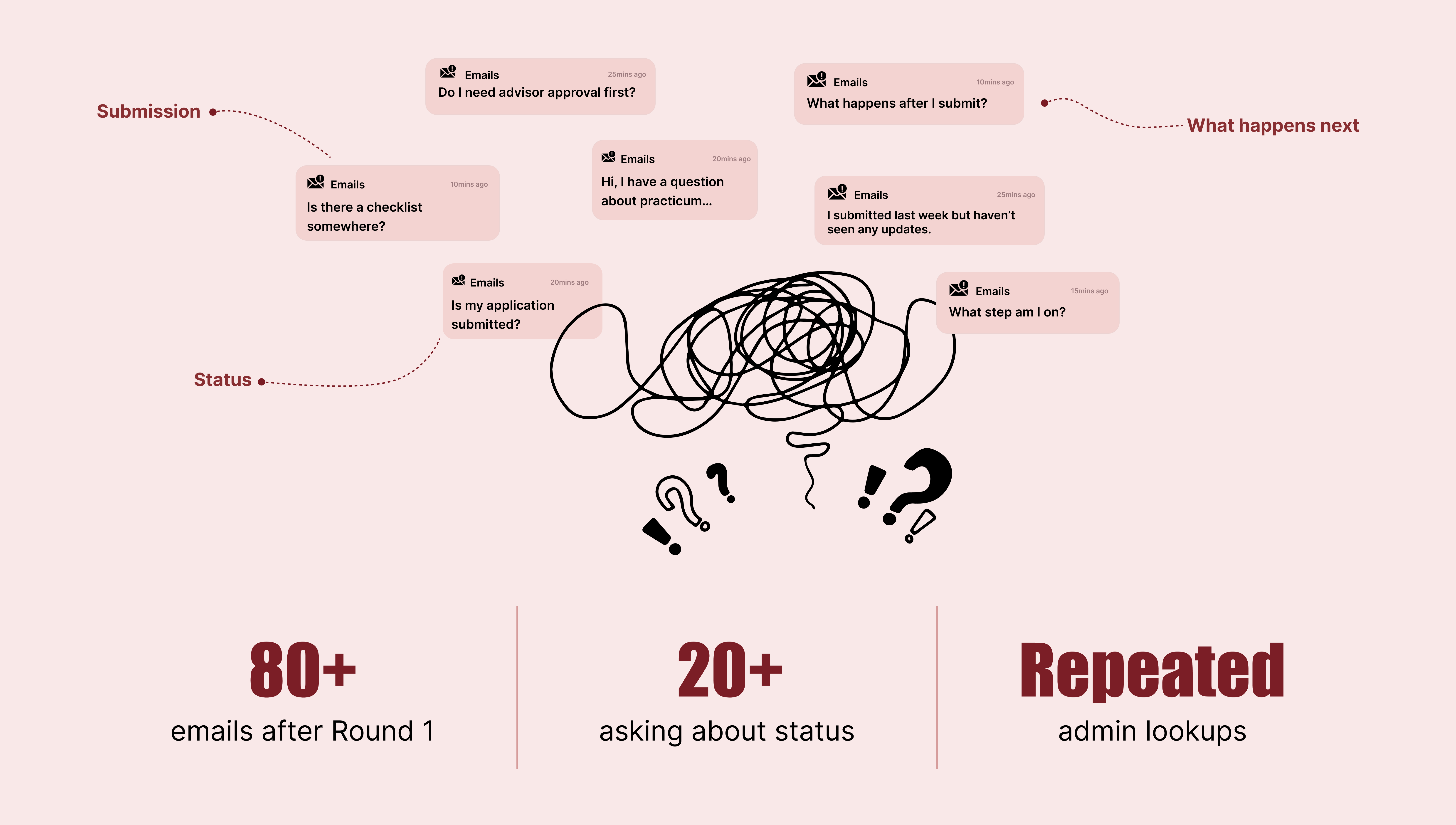
80+ post-round emails · 20+ asking about status or next steps
Mapping the process made the real issue clear: the steps worked, but the transitions between them didn't.
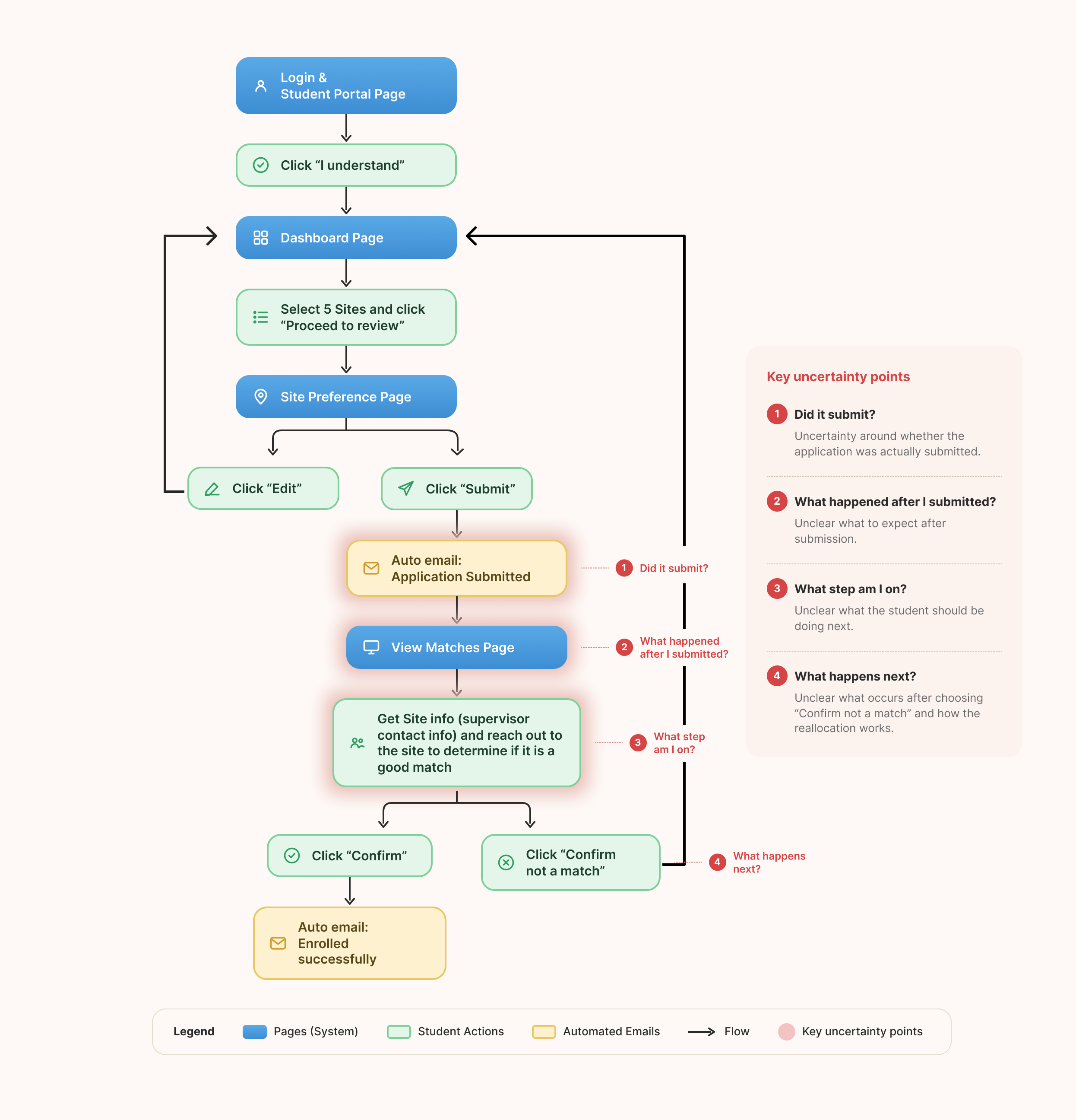
Students could complete the required steps, but the system rarely confirmed what had happened, where they were in the process, or what would happen next. Instead of rebuilding the workflow, I focused on closing those communication gaps.
02 · Making important information easier to prioritize
The first dashboard showed the system. The second helped admins act on it.
V1 · Information Display
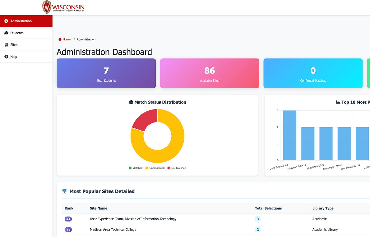
Everything had a place. Nothing had priority.
Visible↓?↓Actionable
V2 · Actionable Dashboard
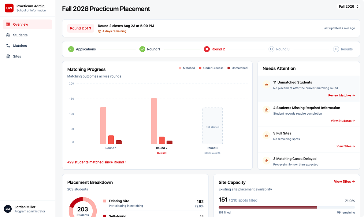
01 Surface exceptions
02 Prioritize urgency
03 Connect insight to action
I defined decision support as the dashboard’s core purpose, then reorganized the hierarchy around exceptions, urgency, and next actions, turning it from a passive report into an operating tool for admins.
03 · Expanding the system to support real-world edge cases
Many of the hardest cases appeared outside the expected matching flow.
I expanded the design beyond the happy path, defining how the system should guide students through the standard flow while making exceptions visible and actionable for administrators.
Reflection
What this changed about how I design.
Clarity before simplicity
Simplifying a workflow does not always mean removing steps. Sometimes the better solution is to make progress, status, and next actions easier to understand.
Design the system, not the screen
Student confusion and admin workload were two sides of the same problem. Designing across both experiences helped me see how one interface decision could reduce friction elsewhere in the system.
Edge cases are part of the product
A workflow is not finished when only the happy path works. Self sourced placements, unmatched students, and reallocation showed me that exceptions need to be designed as deliberately as the main flow.
SEE NEXT
Lyntra · Designing a product from 0 to 1
Designing an AI-powered academic planning experience from zero to one.
Productive Energy Solutions · Website redesign
Reframed the site's information architecture, reducing task time by 30% and driving 10+ inquiries.
Oshkosh · One dashboard for two different engineers
Owned a real-time truck performance dashboard, improving user satisfaction by 25%.