What is Lyntra?
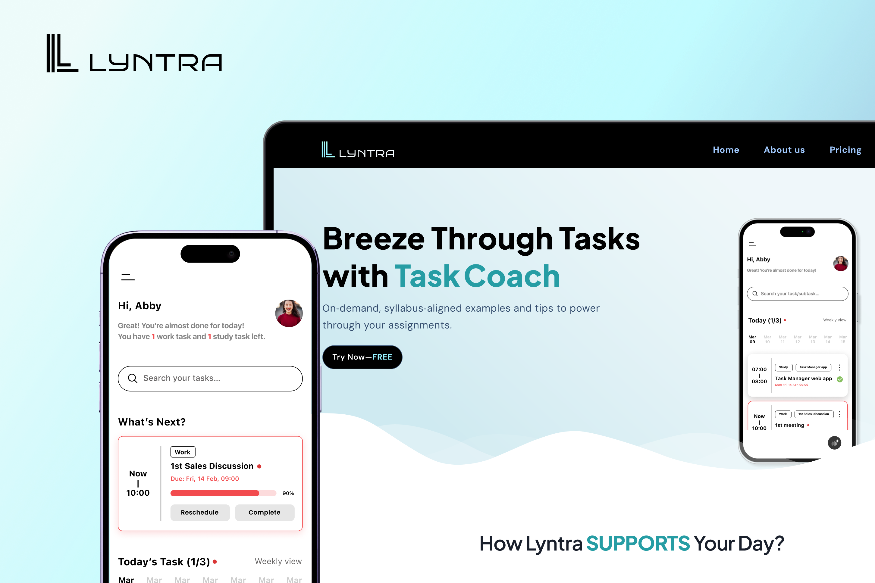
Lyntra connects coursework, deadlines, and calendars into one AI powered planner that can break down tasks, suggest study blocks, and adapt to how a student works.
AI Start-up · Design from 0 to 1
An AI startup building a productivity app for students. I was part of a four person design team navigating eight months of constant feature requests, research driven decisions, and the pressure of shipping something students would actually use.
Lyntra connects coursework, deadlines, and calendars into one AI powered planner that can break down tasks, suggest study blocks, and adapt to how a student works.
I worked across student research, product strategy, four rounds of low fidelity iteration, design systems, and final high fidelity flows with a four person design team.
Context
Students are overwhelmed, and the tools they use are not helping.
Students manage coursework across Canvas, email, and calendar apps. None of these sources talk to each other. This creates a constant mental overhead of tracking what needs to be done and when. Lyntra was built to connect those sources into one planner that could do the heavy lifting while keeping students in control.
The Core Tension
The PM wanted to add. The design team wanted to cut.
Throughout the project, the PM pushed to expand the feature set with more AI tools, more views, and more customization. The design team consistently pushed back. Every feature added was a new thing a student had to learn before getting value from the app. For an audience that already had too much to manage, learning cost was a real barrier.
Pushed to add
More AI tools, analytics views, customization options, and integrations. Each one added complexity to an app designed for people who were already overwhelmed.
Design team position
Every feature that stays in spends the student's attention. We kept only what research showed students would use in the first week, and cut the rest.
This tension shaped every design decision. Research was not something we did only at the beginning. It was the ongoing evidence we used to hold the line.
Research
Interviews, surveys, and competitive analysis all pointing the same direction
We interviewed students and ran surveys to understand how they actually managed their workload, what they had tried before, and where those tools fell short. Alongside that, we mapped the competitive landscape across four adjacent markets: task management, scheduling, learning management systems, and habit building apps, a combined opportunity north of twelve billion dollars in the US alone. Within that space, we compared Lyntra directly against the three closest competitors: Motion, Reclaim AI, and Google Calendar.
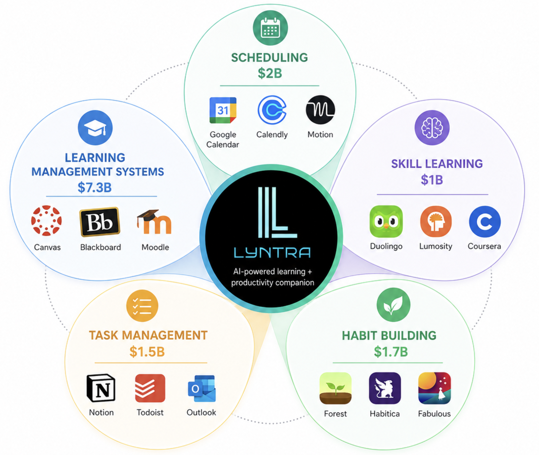 Competitive Landscape Map
Competitive landscape — Lyntra sits at the intersection of task management, scheduling, and skill building, markets worth a combined twelve billion dollars in the US
Student interviews and surveys
Students described setting up productivity tools as its own chore, one they often abandoned within a week. The two things they consistently asked for were a clear sense of what to do first and confirmation that they were not falling behind, not more views or more configuration options.
| Lyntra | Motion | Reclaim AI | Google Calendar | |
|---|---|---|---|---|
| Calendar sync | ||||
| Adaptive scheduling | ||||
| Habit aware scheduling | ||||
| Automated task breakdown | ||||
| Subtask coaching |
Every competitor syncs a calendar. None of them break a task down or coach a student through it
The pattern from the interviews, the surveys, and the competitive scan was consistent. Students did not abandon productivity apps because the apps lacked features. They abandoned them because setup was too heavy and the apps stopped at scheduling, never helping with the actual work inside each task. That gap, between organizing a calendar and getting a task started, was where Lyntra needed to live.
Design Approach
Of the original seven planned features, research and team debate narrowed the product down to three that we could defend with evidence: a smart agenda that handles the planning a student would otherwise do manually, a focus mode that supports them while they work, and an AI chat that helps when they get stuck. Everything else, including a full analytics dashboard and a separate micro learning scheduler, was cut or folded into these three.
Original direction · 7 features
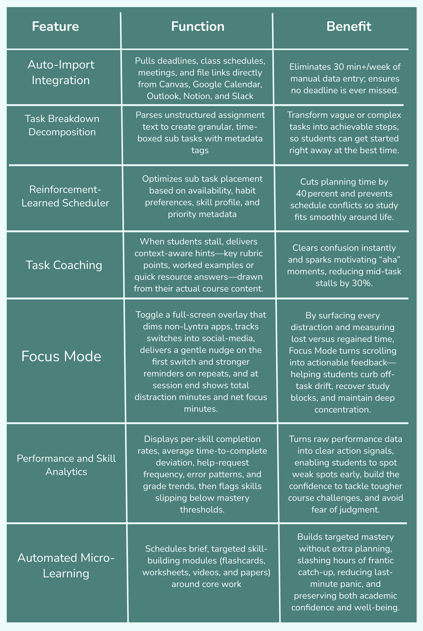
Final direction · 3 features

Breaks deadlines into subtasks and drafts a weekly schedule the student can accept or adjust

Launches when a student starts a subtask, tracks time, and prompts the next step on completion

Answers questions about a task, surfaces course resources, and helps when a student is stuck
With three features instead of seven, every screen had a clearer job to do. Smart Agenda needed to feel trustworthy enough that a student would accept its suggestion instead of rebuilding their schedule by hand. Focus Mode needed to feel supportive rather than like a productivity scoreboard. AI Chat needed to feel like a quick answer, not another app to learn.
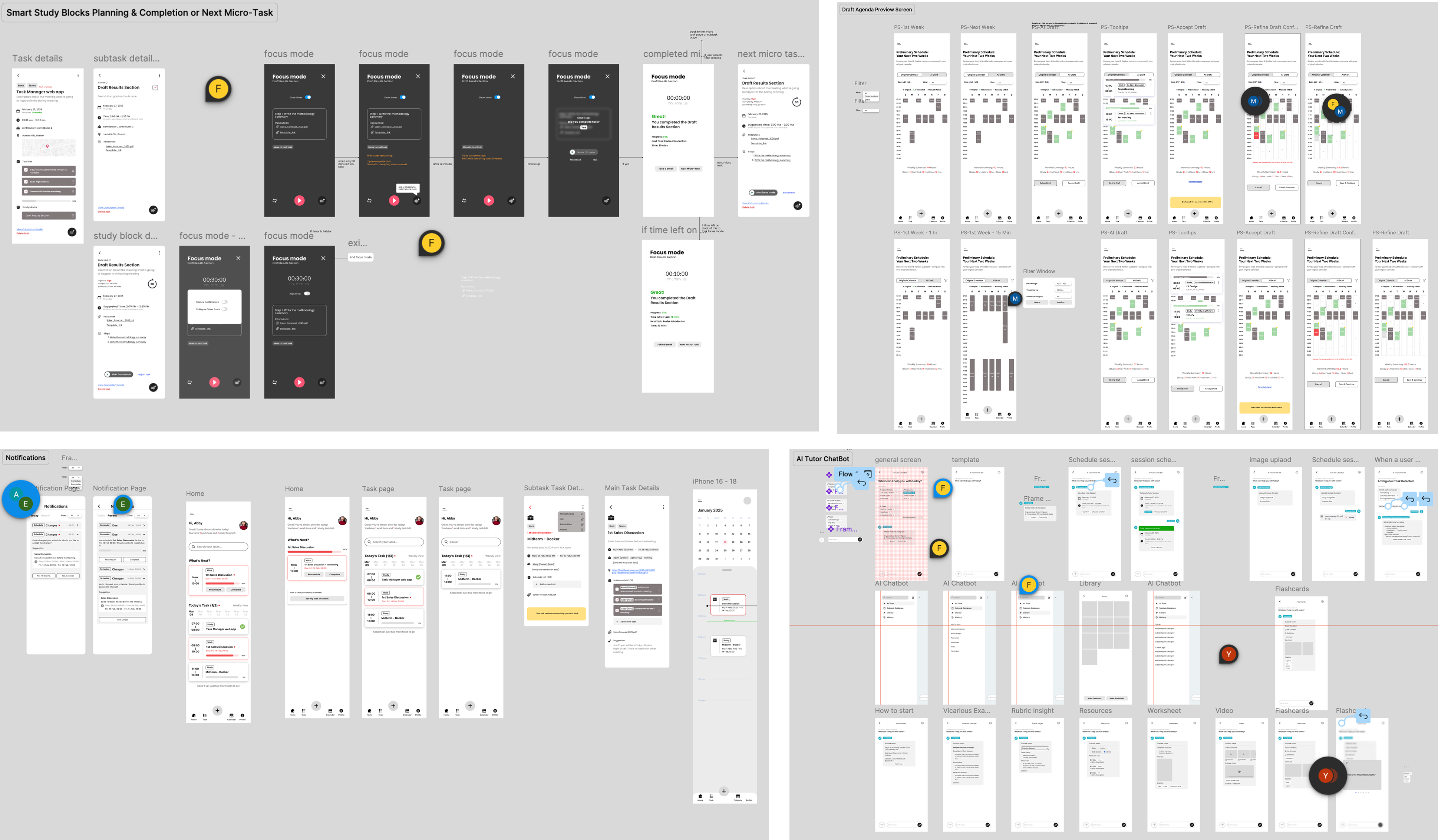
Design approach — Smart Agenda, Focus Mode, and AI Chat working together as one focused student workflow
Solution
Smart Agenda connects a student's calendar and coursework, breaks large assignments into manageable subtasks, and proposes a two-week schedule. Instead of starting with a blank planner, students begin with a draft they can trust and edit.
Focus Mode removes the noise of the full schedule and brings one micro-task forward at a time. Students can track progress, access contextual help, and move directly into the next step without rebuilding their plan.
AI Chat gives students contextual support inside the work they are already doing. It understands the current task, answers questions, and surfaces useful guidance without forcing students to switch tools or rebuild the context of their assignment.
Results
Reflection
The hardest part of this project was not designing the screens. It was deciding what not to design. Every time a new feature was proposed, the question was the same: can we show, from research, that a student would use this in the first week? If the answer was unclear, the feature did not make it in. That discipline was constantly under pressure, and holding the line required being specific. Vague pushback does not work in a startup environment. Data does.
What this project taught me is that good product design in a fast moving team is partly about protecting the user from decisions made in excitement. The PM's instinct to add features came from a real place and each idea was genuinely interesting. But interest is not the same as value, and value is not the same as adoption. The students we interviewed did not need more tools. They needed one tool that removed enough friction that they would actually open it when a deadline was coming. Keeping that in mind, through eight months of iteration and pressure, was the work.
Back to all work